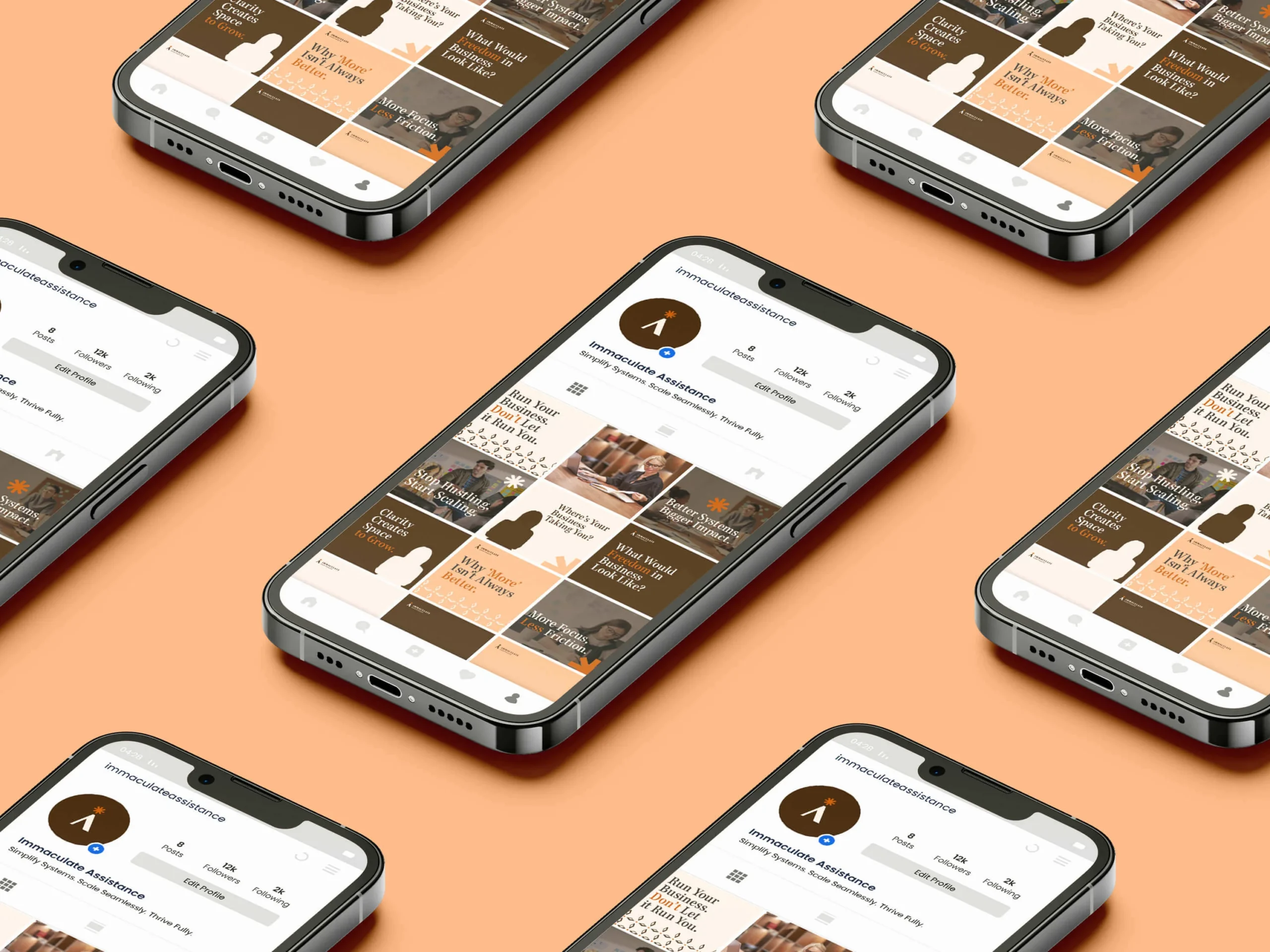
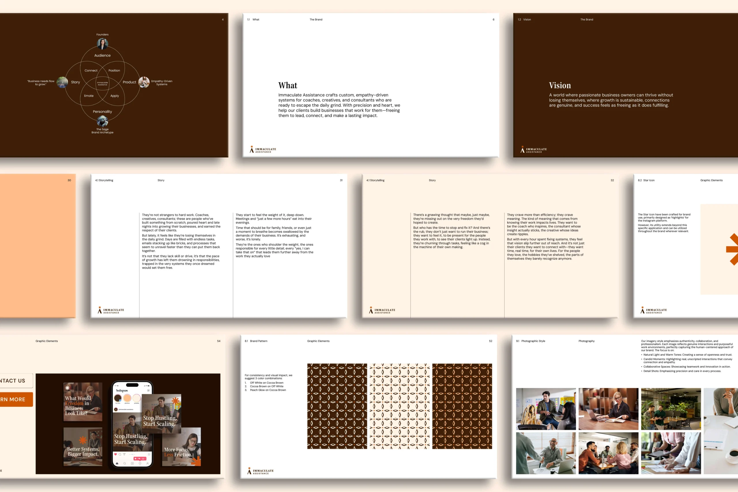
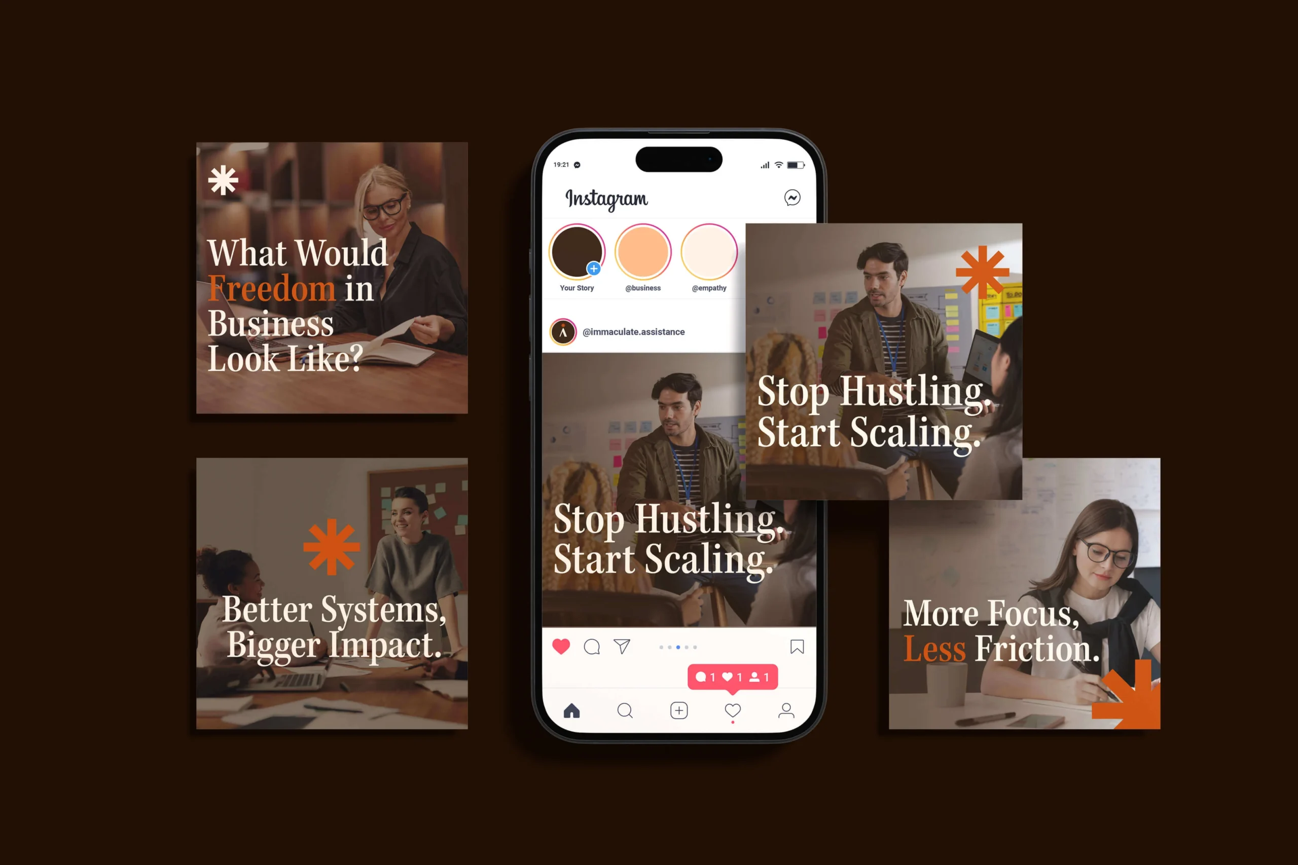
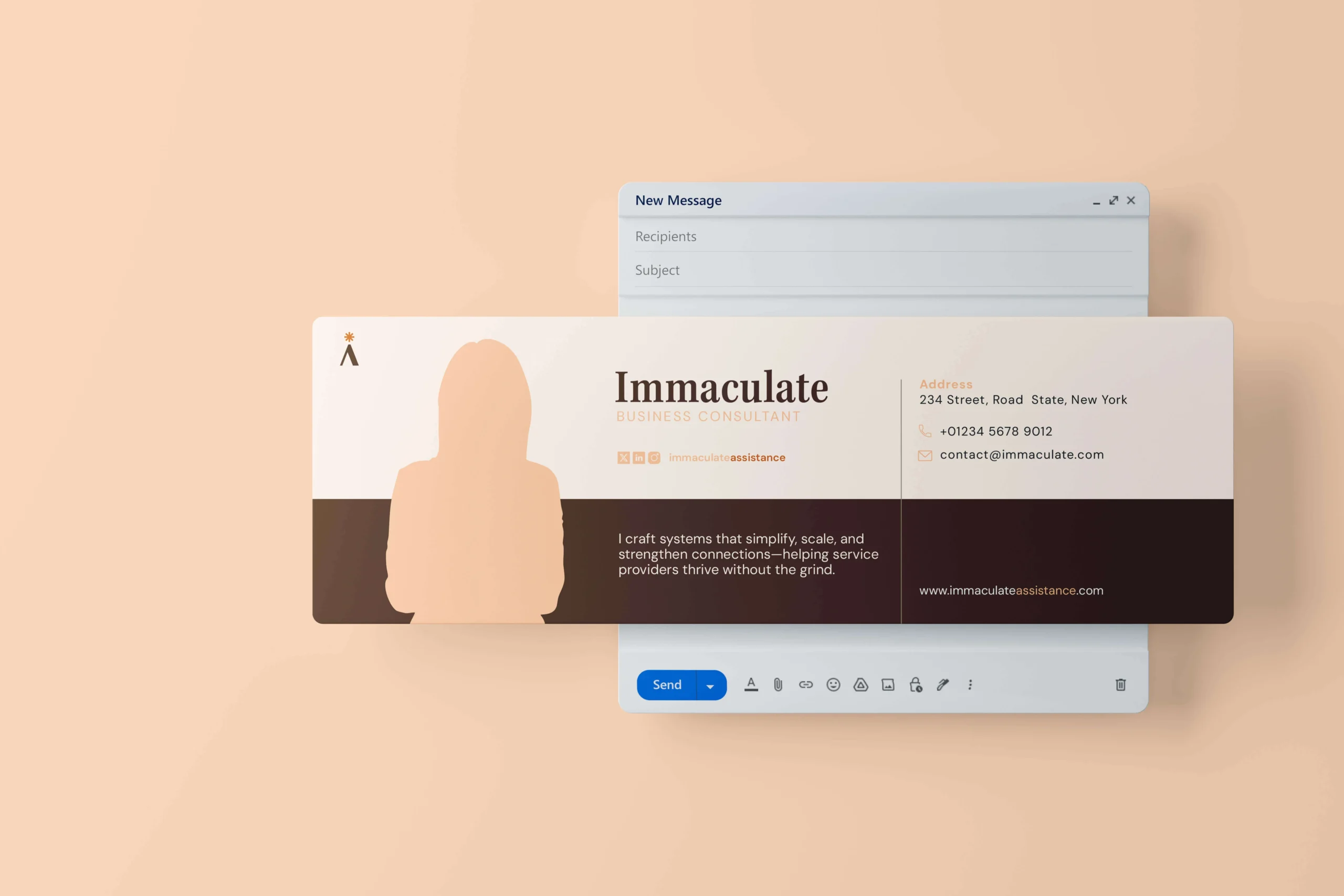
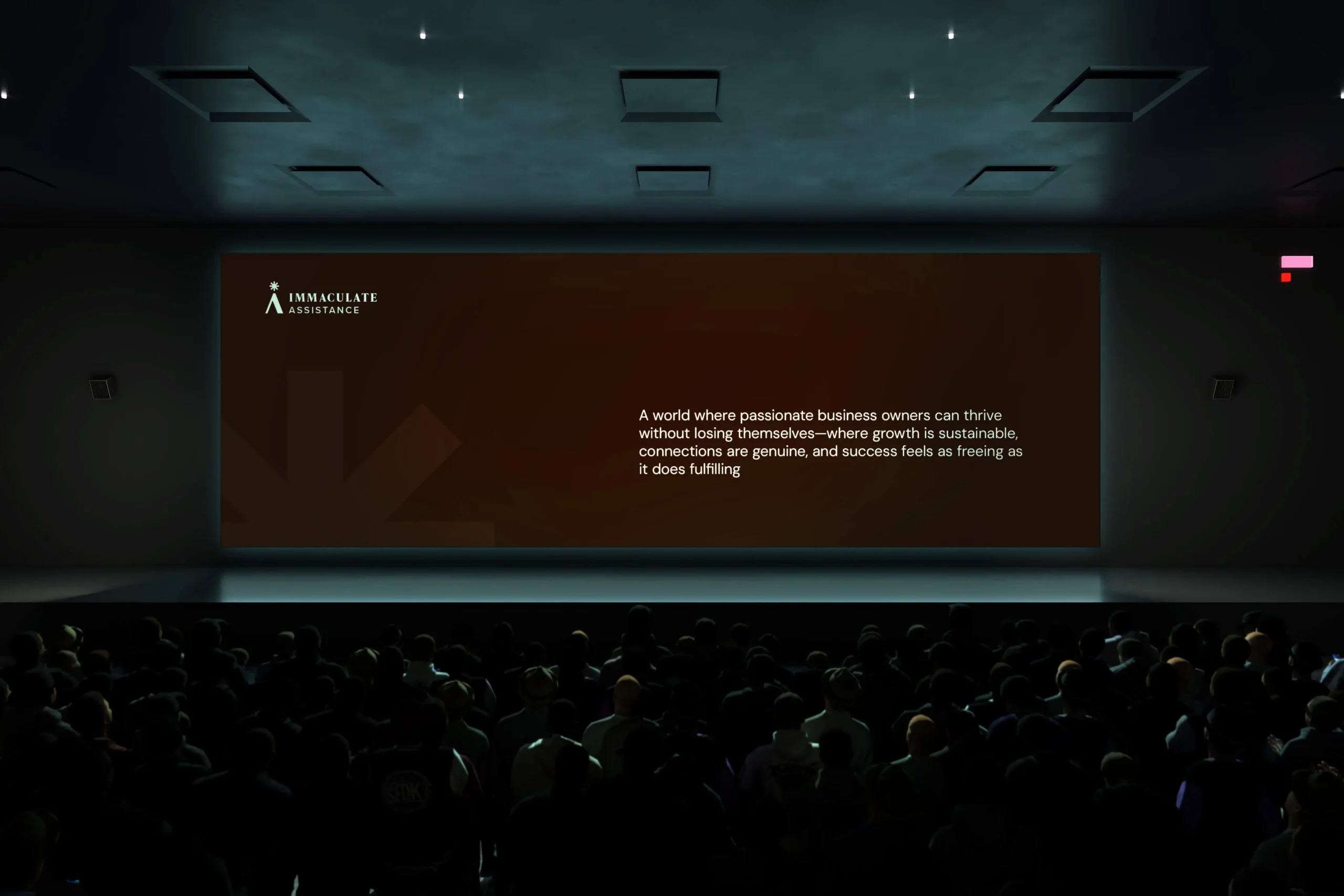
I worked with Immaculate Assistance to build a brand for coaches and creatives who are ready to escape the daily grind. The strategy centered on “empathy-driven systems,” positioning the business as a partner that turns operational chaos into clarity so owners can scale without losing their personal freedom.
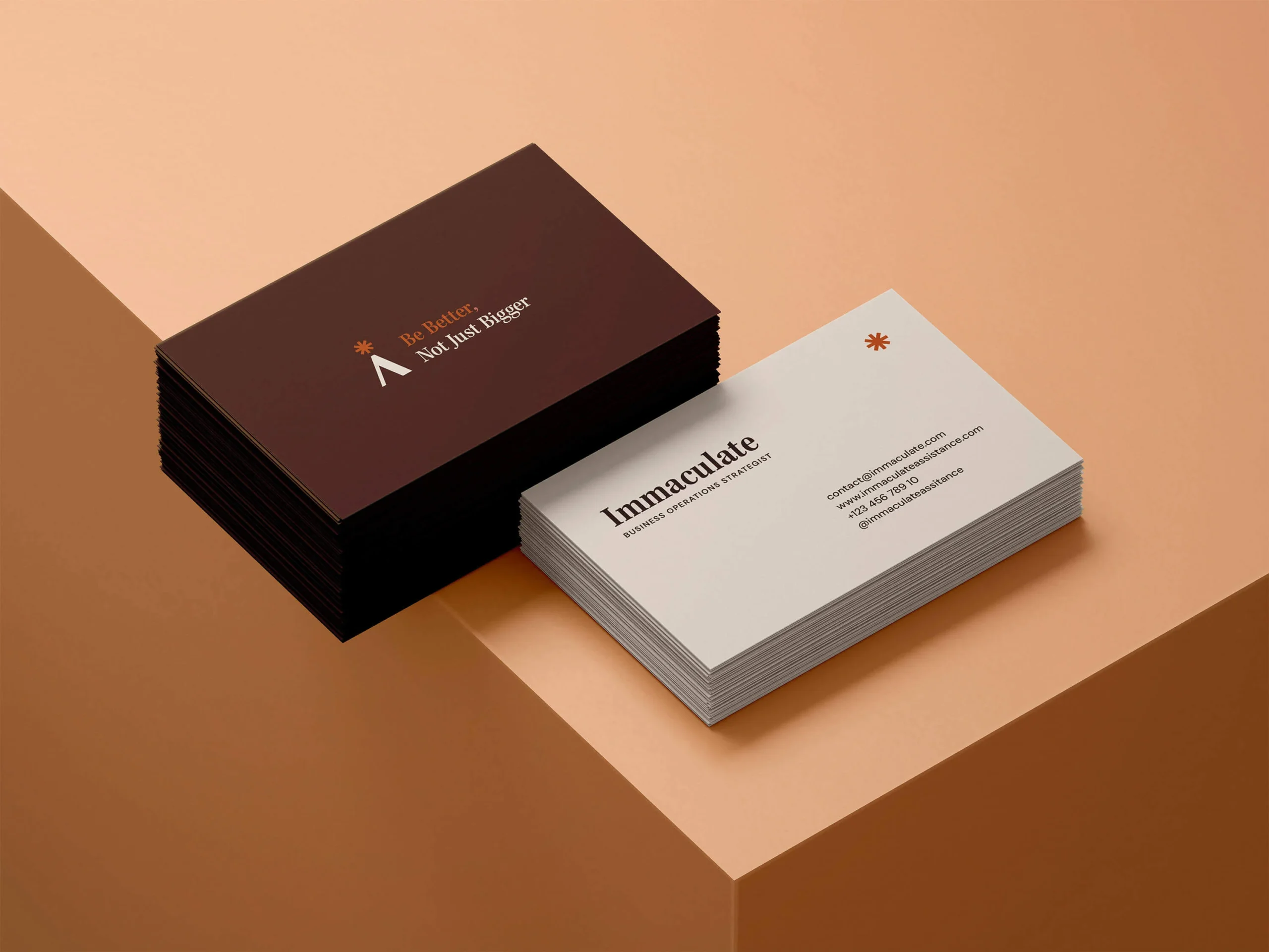
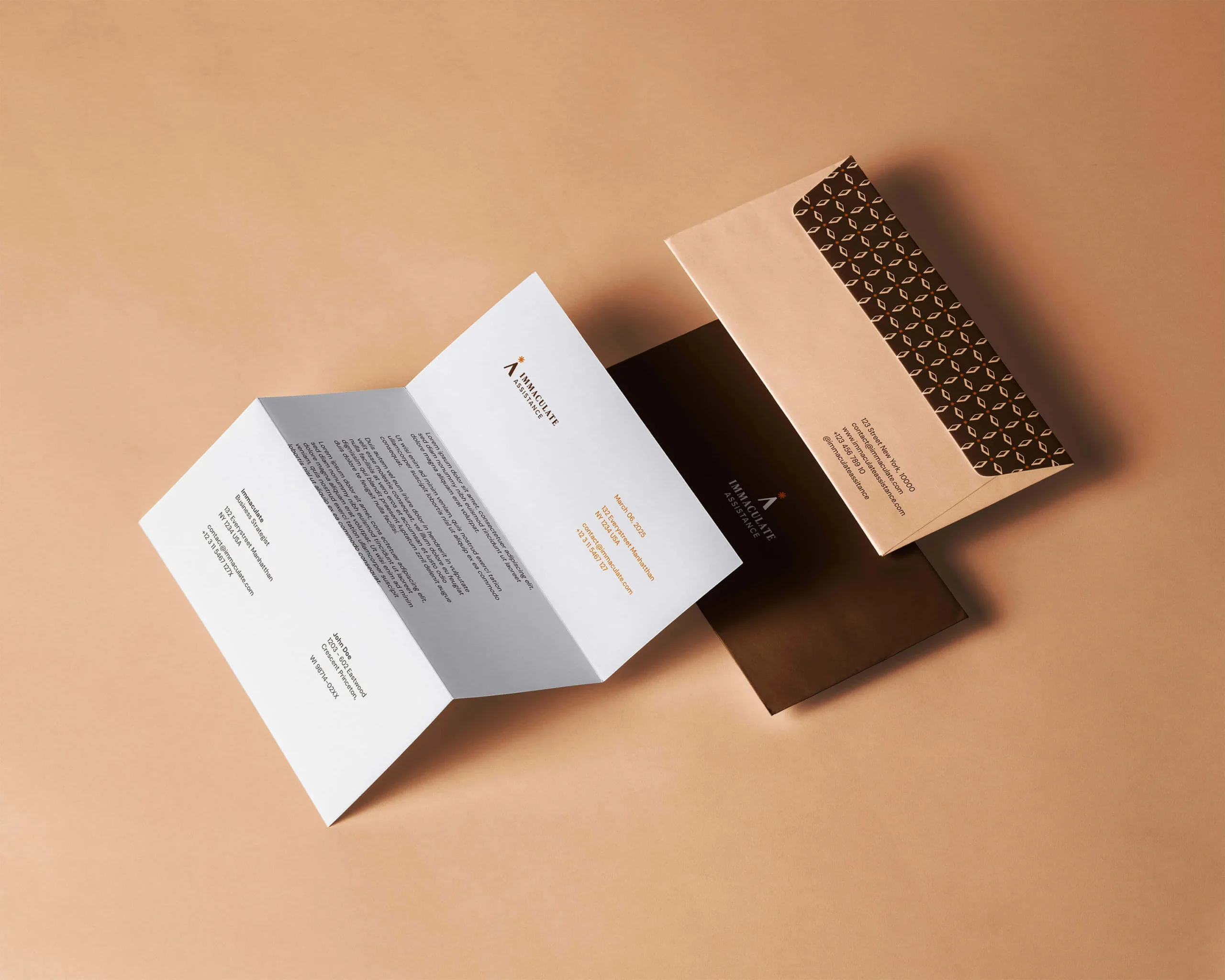
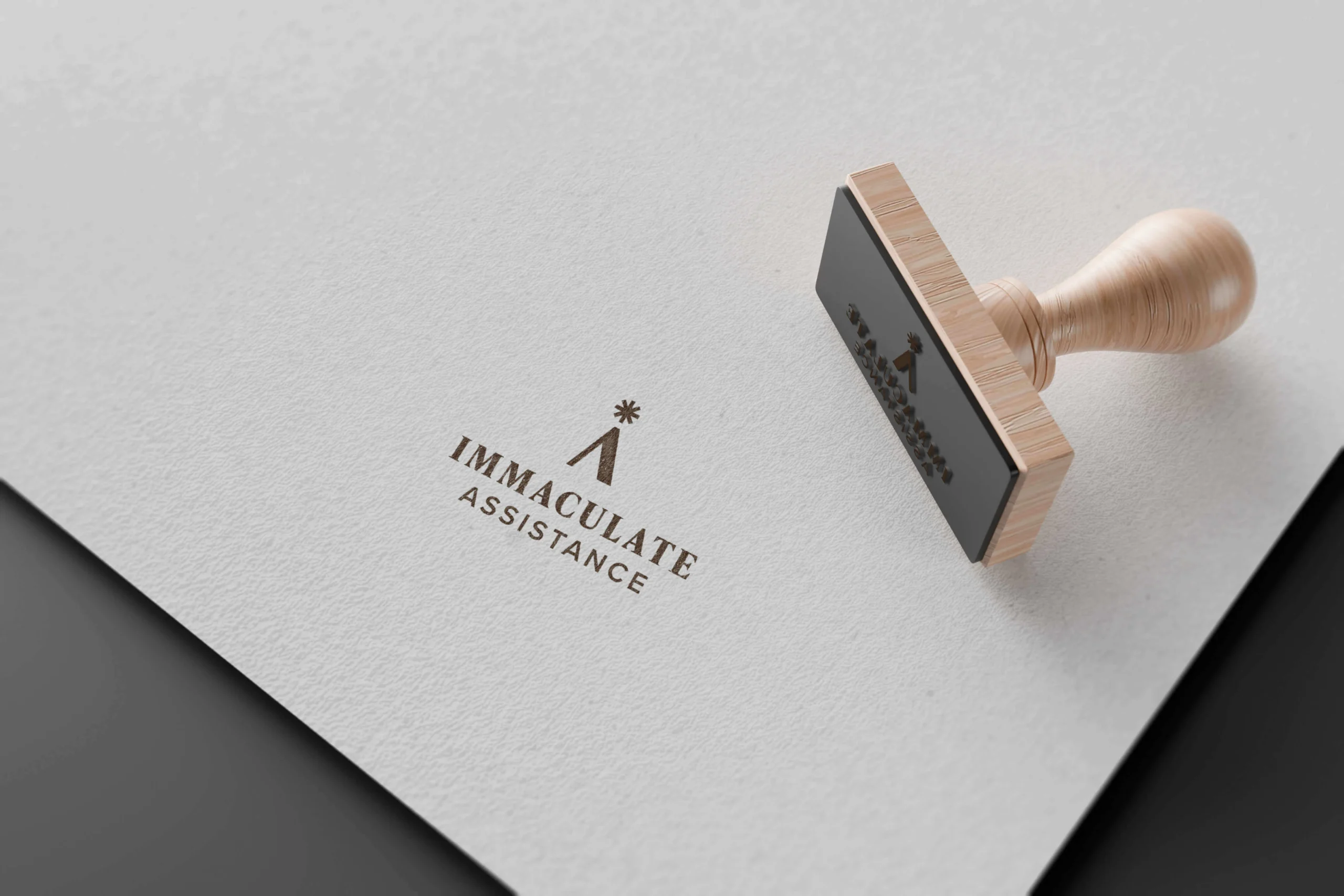
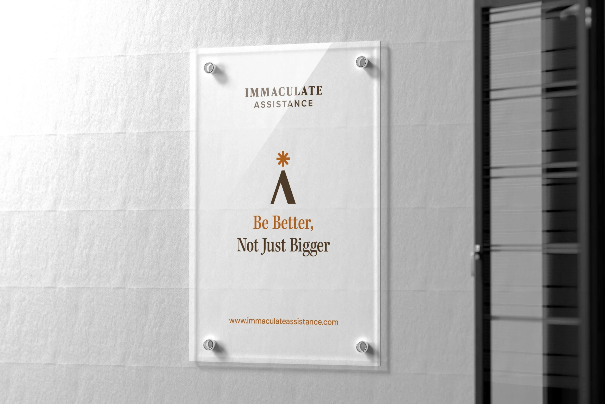
For the visual identity, I focused on a logo symbol that captures this journey. The mark cleverly transforms the letter A into a mountain peak to signify upward growth and direction. At the summit, a star represents the I for Immaculate, symbolizing the moment of realization and clarity that efficient systems provide.
The result is a grounded, trustworthy brand that promises stability through warmth. By combining this strategic depth with a polished visual system, the new identity successfully invites clients to build a business that supports their lifestyle rather than consuming it.